 Since the dawn of man, all humans have known someone who had a friend who was a flight attendant. Here, now, I am that friend.
Ice Art: A Critique
I believe I've mentioned before how bad the art on ice bags can be. I see a lot of different brands of ice (albeit early in the morning, when I'm already in a bad mood and not very charitable), and I thought I'd show you a few of the things I've had to withstand. In my own ridiculous style, here follows a review of several of the most common ice companies' bag art:
 Generic Ice Bag: Simple, but no imagination. Then again, no news is good news, and this is much better than some of the crap designs that follow. I give it a C, just as much for not being bad as not being good.
 Macondo Ice: I'm not sure what a Macondo is, but I kinda like the name. I'm on board already, and the retro "Price Is Right" theme only adds to the presentaion. However, this ice is clearly not crystal clear, as the bag posits. Thumbs up for style, thumbs down for truth in advertising. Again, a C.
 Snowman Ice: This is one of the ones I hate. Here's what is ostensibly a snowman, but he could just as easily be made of dough the way his legjoints work. He's standing on one leg on a block of wood amidst clawmarks from an unseen predator. Illogical, ill-executed, and just plain bad. Its only merit is that it's labeled 'ice,' and it does in fact contain ice. D.
 Jack Frost Ice: Ugh. OK, how long will it take for designers to realize that powder blue and light red are colors that, when paired, should exist only in the 60s? And let's take a look at Jack himself. Wearing underwear on the outside is neither smart nor fashionable. His left arm seems to have been twisted into a stump, yet we can still see his left hand. And he's doing the HEEEyyyy point, which makes him a douchebag. And what's with his eyes? Instead of pupils, he seems to have the lost Sankara stones from Indiana Jones and the Temple of Doom. This one gives me nightmares. F.
 Subservient Eskimo Ice: This one, again, gives me the willies. Here's a random shape that someone thought would look like an igloo if that someone just drew a few lines on it and made a door at the bottom. This guy's not going to fit in there, even if there is a party picnic going on. And let's take a closer look at this dude's face. Those are sharp teeth he's got. This may be the elusive predator that took a shot at the wood-block doughman. Plus, again with the sparkling. Sparkling water doesn't sparkle, and neither does ice. But I am down with monsters where you least expect them. C.
 IceWorks Ice: Now we're getting somewhere. We got art deco going on here. Little problem with the proportions with the buildings in the front (or are those ice towers?), but look at the fade work at the top. This is good work. However:
 ...at the bottom, the address of the factory is listed. Research Blvd., eh? If you have to build a factory on Research Blvd. to figure out the recipe for ice, you're trying too hard. Excellent execution, but lousy IQ. B.
 Mireles Ice: OK, this just looks like the front of an 8th grade cheerleader's math notebook. Mireless is Spanish for 'look at this,' and I can't tell if that's ironic or not. Either way, I don't wanna look at it. D.
 Home City Ice: We have some good art principles going on here, good use of negative and positive space, even if we are back to red and blue again. Home City... makes you think of where you live.. .a comforting setting in which to use ice. However, this is one of those that goes overboard with the description. Ice is frozen water. And here we have "Cube Size Ice Nuggets." Not sure if I want to have all that trouble in my glass. And something about not using the superlative of the word 'healthy' makes the slogan sound a little off. "Healthier than homemade! It's not the healthiest, but it's better that what you can do with your antiquated home ice-making equipment." Great art, but the wordage is a little on the snarky side. B.
 Glace Ice: Now this one is just a pleasure to review. This is a first in all my years of ice looking-at: a three-color design. Blue, white, and off white, just to give the illusion of depth. This is a bear that actually looks like a bear. Also, the bag is translucent blue, which gives an extra touch of class. And, in a postmodern move:
 ...the bag is simply labeled 'ice,' in both English and French. Must be Canadian. A little pretentious, but the art backs it up. A.
 North Hollywood Ice: They say when your enemy goes high-tech, you go low-tech. This approach also works here. You'd think that Hollywood would crank out a glitzy product, but what we have is a simple carriage. But it evokes the Old West days, where folk waited for the ice wagon to roll in and cool things off. You do most of the work in your mind here, but the end result is the same...an image of an oasis of cool in an unforgiving world of hot. No one's driving the carriage though, and that's a little spooky. B+.
 Arctic Glacier Ice: Here again is good work. Three color art, albeit with red and blue again, but the darker blue doesn't clash with the red as much. A trap skillfully avoided. 'Premium ice' is a little overblown of a claim, but while we're on that, let's look at the back:
 ...where an even overblowner claim is made: inside-out frozen ice! Just how does that work? And when it's fully frozen, can anyone but an ice scientist tell the difference? And again they're bagging on us for not being able to use the power of temperature in our own homes, while giving us the 'crystal clear' line again, and check out 'hard-frozen.' Isn't 'soft-frozen' called melted? However, they self-deprecate enough with the next line that I'm willing to believe that they're not all jerks in the ad department. Great art, complicated and dubious science, and a joke. B.
 Spanish Ice: This here says ice in Spanish. Don't believe me? Well just look at the penguin! Direct, and bilingual. Well, single-lingual, because it's not in English too. But the penguin dressed up. B.
 Reddy Ice: They fell into the red/blue trap here, but the clean design and translucent work dig them back out. They should perhaps learn to spell. but the repetition of the Ds draws your eye in toward the snowflake. Design principles at work. B-.
  Crazy Cubes: Now here's crappy. What colors are these? Yup. And as patriotic as that may be, whay exactly is crazy about ice? Or a cube, for that matter? A square six-sided object is about the most stable and predictable thing I can imagine. Plus, with all this GHB scare going on, do you really want crazy in your drink? I don't. Oh, but look where it's manufactured:
 ...yup, New Orleans. That explains it. And you gotta love the translation of "Cubitos Locos." Typical N.O. production...broken all up but with a lot of heart, and that's what gets this one by. C+.
 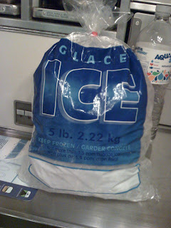 Glace Ice (again): I don't know if this is the same company with a new design, but it's pretty good too. Stark blue with fade work almost makes you feel the cold, right? And look, a warning to keep frozen...why do all ice companies think we're complete idiots? B+.
  All Season Ice: Thought I'd end on a good note. Now this is brilliant. Though one color, the clean lines and use of space knocks out the competition. The sun/snowflake icon is something you'd look at in a magazine or in a gallery, and here it is on a bag of ice. I'd get a tattoo of that. Wonderful. And no bigger-than-science claims about how technically proficient this frozen water is...just a reminder that you can use it anytime. It'll be there for you, whatever the season. Stellar. A+.
Generic Ice Bag: Simple, but no imagination. Then again, no news is good news, and this is much better than some of the crap designs that follow. I give it a C, just as much for not being bad as not being good. Macondo Ice: I'm not sure what a Macondo is, but I kinda like the name. I'm on board already, and the retro "Price Is Right" theme only adds to the presentaion. However, this ice is clearly not crystal clear, as the bag posits. Thumbs up for style, thumbs down for truth in advertising. Again, a C.
 Snowman Ice: This is one of the ones I hate. Here's what is ostensibly a snowman, but he could just as easily be made of dough the way his legjoints work. He's standing on one leg on a block of wood amidst clawmarks from an unseen predator. Illogical, ill-executed, and just plain bad. Its only merit is that it's labeled 'ice,' and it does in fact contain ice. D.
 Jack Frost Ice: Ugh. OK, how long will it take for designers to realize that powder blue and light red are colors that, when paired, should exist only in the 60s? And let's take a look at Jack himself. Wearing underwear on the outside is neither smart nor fashionable. His left arm seems to have been twisted into a stump, yet we can still see his left hand. And he's doing the HEEEyyyy point, which makes him a douchebag. And what's with his eyes? Instead of pupils, he seems to have the lost Sankara stones from Indiana Jones and the Temple of Doom. This one gives me nightmares. F.
 Subservient Eskimo Ice: This one, again, gives me the willies. Here's a random shape that someone thought would look like an igloo if that someone just drew a few lines on it and made a door at the bottom. This guy's not going to fit in there, even if there is a party picnic going on. And let's take a closer look at this dude's face. Those are sharp teeth he's got. This may be the elusive predator that took a shot at the wood-block doughman. Plus, again with the sparkling. Sparkling water doesn't sparkle, and neither does ice. But I am down with monsters where you least expect them. C. IceWorks Ice: Now we're getting somewhere. We got art deco going on here. Little problem with the proportions with the buildings in the front (or are those ice towers?), but look at the fade work at the top. This is good work. However:
 ...at the bottom, the address of the factory is listed. Research Blvd., eh? If you have to build a factory on Research Blvd. to figure out the recipe for ice, you're trying too hard. Excellent execution, but lousy IQ. B.
 Mireles Ice: OK, this just looks like the front of an 8th grade cheerleader's math notebook. Mireless is Spanish for 'look at this,' and I can't tell if that's ironic or not. Either way, I don't wanna look at it. D.
 Home City Ice: We have some good art principles going on here, good use of negative and positive space, even if we are back to red and blue again. Home City... makes you think of where you live.. .a comforting setting in which to use ice. However, this is one of those that goes overboard with the description. Ice is frozen water. And here we have "Cube Size Ice Nuggets." Not sure if I want to have all that trouble in my glass. And something about not using the superlative of the word 'healthy' makes the slogan sound a little off. "Healthier than homemade! It's not the healthiest, but it's better that what you can do with your antiquated home ice-making equipment." Great art, but the wordage is a little on the snarky side. B.Glace Ice: Now this one is just a pleasure to review. This is a first in all my years of ice looking-at: a three-color design. Blue, white, and off white, just to give the illusion of depth. This is a bear that actually looks like a bear. Also, the bag is translucent blue, which gives an extra touch of class. And, in a postmodern move:
 ...the bag is simply labeled 'ice,' in both English and French. Must be Canadian. A little pretentious, but the art backs it up. A.
 North Hollywood Ice: They say when your enemy goes high-tech, you go low-tech. This approach also works here. You'd think that Hollywood would crank out a glitzy product, but what we have is a simple carriage. But it evokes the Old West days, where folk waited for the ice wagon to roll in and cool things off. You do most of the work in your mind here, but the end result is the same...an image of an oasis of cool in an unforgiving world of hot. No one's driving the carriage though, and that's a little spooky. B+.
 Arctic Glacier Ice: Here again is good work. Three color art, albeit with red and blue again, but the darker blue doesn't clash with the red as much. A trap skillfully avoided. 'Premium ice' is a little overblown of a claim, but while we're on that, let's look at the back:...where an even overblowner claim is made: inside-out frozen ice! Just how does that work? And when it's fully frozen, can anyone but an ice scientist tell the difference? And again they're bagging on us for not being able to use the power of temperature in our own homes, while giving us the 'crystal clear' line again, and check out 'hard-frozen.' Isn't 'soft-frozen' called melted? However, they self-deprecate enough with the next line that I'm willing to believe that they're not all jerks in the ad department. Great art, complicated and dubious science, and a joke. B.Spanish Ice: This here says ice in Spanish. Don't believe me? Well just look at the penguin! Direct, and bilingual. Well, single-lingual, because it's not in English too. But the penguin dressed up. B. Reddy Ice: They fell into the red/blue trap here, but the clean design and translucent work dig them back out. They should perhaps learn to spell. but the repetition of the Ds draws your eye in toward the snowflake. Design principles at work. B-. Crazy Cubes: Now here's crappy. What colors are these? Yup. And as patriotic as that may be, whay exactly is crazy about ice? Or a cube, for that matter? A square six-sided object is about the most stable and predictable thing I can imagine. Plus, with all this GHB scare going on, do you really want crazy in your drink? I don't. Oh, but look where it's manufactured:...yup, New Orleans. That explains it. And you gotta love the translation of "Cubitos Locos." Typical N.O. production...broken all up but with a lot of heart, and that's what gets this one by. C+.Glace Ice (again): I don't know if this is the same company with a new design, but it's pretty good too. Stark blue with fade work almost makes you feel the cold, right? And look, a warning to keep frozen...why do all ice companies think we're complete idiots? B+.All Season Ice: Thought I'd end on a good note. Now this is brilliant. Though one color, the clean lines and use of space knocks out the competition. The sun/snowflake icon is something you'd look at in a magazine or in a gallery, and here it is on a bag of ice. I'd get a tattoo of that. Wonderful. And no bigger-than-science claims about how technically proficient this frozen water is...just a reminder that you can use it anytime. It'll be there for you, whatever the season. Stellar. A+.
posted by Phil at 10:34 PM
58 comments
![]()


